Where is my train? TfL edition
It’s been a while since I last posted, but I’m trying to get back into the groove. Every so often I start a new project that I think is genuinely cool — but really, it’s an excuse to experiment with technologies I haven’t had the opportunity to tinker with before. This time, it was implementing Kafka and PySpark to stream data into a web application, and then overcoming challenges to productionise this application.
TLDR
I’ve built a web app that shows live positions of London Tube trains on a map. Kafka streams TfL’s open data into a Postgres DB, and the frontend is a Next.js 15 / React 19 TypeScript app. The associated repo is here - Have a play!
Demo: Live London Tube train locations powered by Kafka and Mapbox
Introduction
This project started with one goal: learn Kafka and PySpark by building a realtime streaming application on a production-grade stack. The tech is admittedly overkill for the data volumes involved, but the point was to see how all the pieces fit together end-to-end.
Picture this: you’re standing on the District line platform at Earls Court, waiting for a train towards Edgware Road. The departure board only shows trains headed your way about 5 minutes out. Wouldn’t it be nice to know earlier?
Thanks to TfL Open Data, we can get near-realtime train position data. The plan: pull it from an API, transform the raw XML data to extract each train’s latest position, and plot them on a map.
Data - TFL endpoints
We make use of 2 main sources of data — the prediction summary endpoint and the TfL StopPoint API. Note you might have to create a TfL account to access those pages.
TFL prediction summary
If you do not have a TfL account, this PDF will provide detailed information on the API endpoints. Essentially the information returned will be a list of stations on a line. Each station will display trains within a 30 minute arrival/departure window, the time it will take to reach that station, its destination and its estimated position.
TfL StopPoint API
The StopPoint API provides the exact coordinates of the tube stations and the Line Route Sequence. These are run once to obtain a list of station coordinates and line sequences and used for visualisations on the map.
A script calls the line route API to get ordered NaptanId sequences per line. For each consecutive pair, it looks up the station’s stored location point. It then builds a linestring between adjacent stations to construct the line in between stations.
These segment geometries are then used to:
- Render line routes on the map (/api/lines)
- Interpolate train positions between stations.
Developing - where to begin?
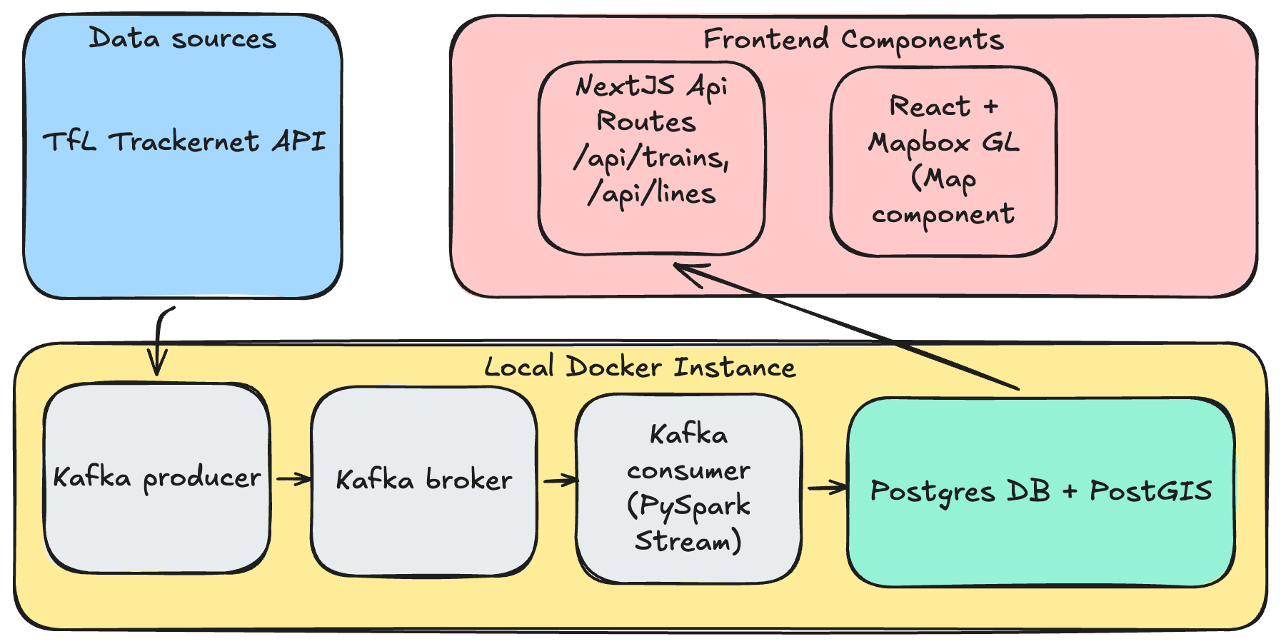
The goal was straightforward: ingest data from the prediction summary endpoint, transform it, and store it in a database — all in realtime. For that, I went with a standard Kafka producer → broker → consumer setup, keeping it simple with a single topic.
A dockerised Python script would serve as the Kafka producer, calling the API endpoint every 30 seconds (limits imposed by the endpoint) which loops through a list of London Underground lines. It then pushes the events onto a topic on the Kafka broker. This Kafka broker runs in a separate Docker container. It is possible to customise the run mode, but for the sake of simplicity, it will be running on a single node. Finally, the consumer is a pyspark script that performs XML transformations into a structured tabular format before pushing the data into a postgres database (also a separate Docker container).
The Postgres DB contains tables for train positions, lines, and stations, plus a view that determines the latest position of each train. Since the raw data shows relative positions of trains from multiple stations, the way to pin down where a train actually is: order each distinct train (identified by set_number + line_code) by time_to_station and take the lowest value. The table in the Position Calculation section below shows this in practice.
Finally, the web app is a TypeScript application built on Next.js 15 with React 19, using the App Router. It was created largely via Claude Code, which handled everything from scaffolding the project to implementing the more complex position-calculation logic. The frontend renders a full-screen interactive map of London powered by Mapbox GL JS.
On the server side, Next.js API routes query the Postgres database (using the pg library locally) and return train positions as GeoJSON FeatureCollections. The most involved piece of server-side logic is the position calculator — it parses the natural-language current_location strings from the TfL data and uses a station adjacency graph along with time_to_station values to interpolate each train’s geographic coordinates between two stations. More details below.
More details about how the visualisations get materialised are in the sections below.
Position Calculation
TrackerNet does not provide geographic coordinates for trains. Positions are calculated from the current_location free-text field using regex pattern matching. The parser recognises patterns like "At {station} Platform {n}", "Approaching {station}", "Left {station}", "Between {station1} and {station2}", "Departed {station}", and "Held at {station}". Once parsed, the station names are resolved to lat/lng via the stations table, and the time_to_station field is used to interpolate along the segment between two known points.
For example, a train “Between Acton Town and Ealing Common” with time_to_station = "0:30" is placed 75% of the way along that segment (assuming a 120-second default travel time). Trains that can’t be positioned are logged and excluded from the API response.
To determine the appropriate last known positions for each train, some custom logic has to be applied on the raw data. First, the latest batch of data is ordered based on the time_to_station value. If the value is -, that usually indicates that the train is on a platform and that would be the corresponding location of that train. See the example below that shows how the latest positions for Train 205 on the Victoria line and Train 312 on the Central line are determined:
| set_number | line_code | station_name | current_location | time_to_station |
|---|---|---|---|---|
| 205 | V | Pimlico | Approaching Pimlico | 0:30 |
| 205 | V | Victoria | Between Pimlico and Victoria | 2:30 |
| 205 | V | Vauxhall | Between Stockwell and Vauxhall | 4:00 |
| 205 | V | Stockwell | Approaching Stockwell | 6:00 |
| 312 | C | Oxford Circus | At Platform | - |
| 312 | C | Bond Street | Approaching Oxford Circus | 1:30 |
| 312 | C | Tottenham Court Rd | Between Bond Street and Oxford Circus | 3:00 |
| 312 | C | Holborn | Approaching Tottenham Court Rd | 5:15 |
Predicted Departure Animation
Predicted departure animation: train at platform animates toward next station after 30s dwell
When a train is at a platform (time_to_station = "-"), it has no ETA so dead-reckoning can’t move it. To negate having a static visual of trains on platform we introduced a ‘departure mechanism’ whereby after 30 seconds of dwell, the client begins a predicted departure animation toward the next station. The next station is determined by using the adjacency graph and the train’s final destination (the neighbour closest to the destination by straight-line distance is chosen). Movement is capped at 35% of the segment to limit prediction error. When real data arrives confirming departure, the blend mechanism smoothly corrects the position.
Client-Side Animation
Dead-reckoning: trains interpolate between polls; blend corrects when new data arrives
The frontend polls the API every 10 seconds but animates train positions at 60fps using dead-reckoning. Each train has a from position, a to position (next station), and an ETA. Between polls, the client linearly interpolates along this trajectory based on elapsed wall-clock time. When new data arrives, a 1.5-second ease-out blend reconciles any discrepancy between the predicted and actual position. Trains that temporarily disappear from the API (e.g., unresolvable position in one poll) are retained for 90 seconds before removal, preventing flicker.
Workarounds
As with most real-world data, TfL’s feeds aren’t exactly clean and ready to go. Here are the workarounds I had to apply.
Station Name Resolution
TrackerNet and the StopPoint API use different naming conventions. For example, TrackerNet returns "Edgware Road (H & C)." while the database has "Edgware Road (Circle Line)", and "Heathrow Terminals 123" maps to "Heathrow Terminals 2 & 3". This is handled by a station name alias map for known mismatches, plus fuzzy matching that strips parenthetical suffixes.
Hammersmith & City and Circle line trains shared code
The Circle line and Hammersmith & City line share TfL line code H, so both are rendered together (even though they should be treated as separate lines because these 2 TfL lines are confusing!)
Duplicate trains reported on different lines
The TfL API sometimes reports the same physical train on District, Hammersmith & City, and Metropolitan Lines with the same current_location (e.g. “At North Wembley Platform 2”), even though North Wembley is only on the Bakerloo line.
To negate this, the current_location is parsed to get the station name, resolved to a station code, and checked against the stations database whether that station is on the train’s line_code. If it isn’t, the record is dropped.
Station Adjacency Graph
The adjacency graph is built by a script that calls the TfL Line Route Sequence API for each tube line. This returns ordered lists of station NaptanIds representing each branch of a line. The script walks each sequence pairwise to create (from_station, to_station) adjacency records and constructs PostGIS LINESTRING geometry for each segment using the station coordinates.
Productionising web app from local set up
Next up: getting this thing running somewhere other than my laptop. I asked Claude for deployment options and it threw a few suggestions at me:
- Managed Kafka instances - Confluent Cloud, Oracle Cloud VM, AWS MSK
- Web UI - Vercel
- Managed Postgres DB - Supabase and Neon
The guiding principle was simple: spend nothing. Stick to free tiers wherever possible, but keep the thing actually running.
Eventually, the target architecture was:
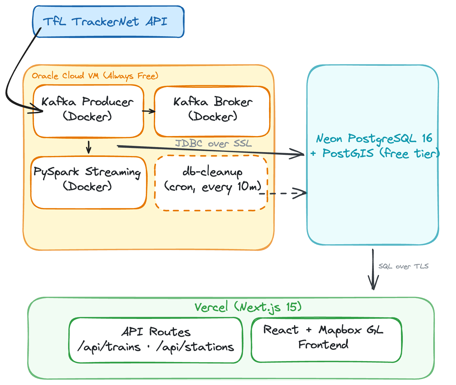
PostgreSQL DB hosting: Self-hosted Docker to Neon Serverless
In local development, PostgreSQL runs as a Docker container alongside Kafka and PySpark. This is simple to set up locally, but in a deployed web app, we needed to split the architecture across multiple free-tier services. The Oracle Cloud VM runs Kafka, the producer, and PySpark (~3GB RAM combined), but hosting Postgres there too would add memory pressure and require managing backups, upgrades, and disk.
I moved the database to Neon — a serverless PostgreSQL provider with a free tier that includes PostGIS support. Neon auto-suspends the database after 5 minutes of inactivity to save compute, but since PySpark writes every ~10 seconds, it stays warm during normal operation. The trade-off is a ~1-2 second cold start if the pipeline ever stops and someone loads the web app so you will see slight lags when loading the map if there has not been a request made in a while.
Database Driver: Connection Pooling vs Serverless
This was one of the more subtle changes. Locally, the Next.js app uses the standard pg (node-postgres) library, which opens a persistent TCP connection pool to the database. This works well on a long-running Node.js server.
On Vercel, however, API routes run as serverless functions — each invocation spins up in its own ephemeral container, executes, and dies. A traditional TCP connection pool doesn’t survive between invocations, meaning every API call would open a new database connection, go through the TCP handshake + SSL negotiation, run the query, and tear it down. Under load, this can exhaust Neon’s connection limits.
Instead in the live app, Neon’s serverless driver (@neondatabase/serverless) replaces TCP with HTTP/WebSocket-based connections purpose-built for serverless environments.
Storage Management: Overcoming the 0.5GB limit in Neon
This was arguably the biggest operational lesson. Neon’s free tier provides 0.5GB of storage. The train positions table ingests roughly 150 bytes per row, and with ~4,500 rows per poll across 10 tube lines every 30 seconds, the data grows fast up to 600MB per day.
In production, we had to:
- Increase cleanup frequency from hourly to every 10 minutes
- Reduce retention from 1 day to 2 hours
- Add VACUUM after each cleanup to reclaim disk space after deletes This keeps the table around ~100MB, leaving headroom for the stations, adjacency graph, and indexes within the 0.5GB limit.
Work to be done
Rough around the edges - teleporting trains
Despite the best efforts of the workarounds to deal with animating train movements and their relative positions, there are still cases of teleporting trains and missing trains re-appearing. The latter is caused by a mix of poor data quality and inability to identify the train’s position as the station or geographical location cannot be located against a station in the stations table.
Example: "Teleporting trains" bug observed during development (click to play)
Predicted positions
The predicted positions are currently estimated from the time_to_station value. This may result in inaccuracies and the result is a sudden ‘jump’ in the positions of the train.
Key learnings
Pyspark is overkill for the scale
As you can probably tell, ~1MB every 30 seconds does not warrant PySpark. A Kafka Streams sink connector with Pandas would have done the job just fine. But that wasn’t really the point — I wanted to see what an event-driven streaming architecture actually looks like in production.
The Free-Tier Architecture Split
The bigger lesson: a $0 budget forces architectural decisions you’d never make otherwise. Instead of one server running everything, each component landed on whichever platform’s free tier fit it best.
The trade-off is more moving parts and network hops (PySpark on Oracle writes over the internet to Neon in Frankfurt, Vercel functions query Neon on each request), but everything runs for free.
Prompting Claude
Claude did a bulk of the heavy lifting, especially on the web app. But what made it worthwhile was how building alongside it forced me to understand how the data backend pieces actually fit together — culminating in something I could interact with and poke at.
My workflow utilises a mix of Claude Code and Cursor. I do like the plan mode (with Opus 4.6) in both systems and what I typically do is engage with them on Plan mode to generate an architecture design and data flow architecture. I did not flood my Claude.md file with onerous instructions - it was really just a bunch of coding best practices for Python and a brief description of the architecture.
The next interesting thing to explore is running agents in parallel. Currently I am set up with a couple of bespoke agents - a data engineering agent focused on building the pipelines and a data architect agent focused on architecting data flows and the infrastructure. With a much more clearly defined project scope up front, I think there’s a lot of potential to speed up development significantly — but that’s a post for another day.
Wow you actually got to this part of the post - thanks a lot for your attention and dedication to reading this post!